ToggleButtonsを使っている実装をどのようにすればSegmentedButtonに変更できるか検討してみたい。
きっかけ
Flutter-InkWellでToggleButtonsを調べていて、代替とSegmentedButtonがあるよということに気が付いた。
もうちょっと資料をよく見たら以下のような記述があった。
ToggleButtons, a similar widget that was built for Material 2.
SegmentedButton should be considered as a replacement for ToggleButtons.ToggleButtons は、Material 2 用に作成された同様のウィジェットです。
SegmentedButton は、ToggleButton の代わりと見なす必要があります。
後、Material 2についても調べてみたらそこには以下のような記述があった。
Support for Material 2 will eventually be removed according to Flutter’s deprecation policy.
マテリアル 2 のサポートは、Flutter の非推奨ポリシーに従って最終的に削除されます。
つまり、ToggleButtonsは将来非推奨になるかもしれないのでSegmentedButtonを使いましょうということらしい。
呼び出し方の比較
- ToggleButtons
子供のWidgetとその選択状態をListで渡す形になっている。
タップ(マウス押下)されたWidgetは、その位置を番号としてonPressedに呼び出しがされる。 - SegmentedButton<T>
子供のWidgetはList<ButtonSegment<T>>で渡し、選択状態をSet<T>で渡す。
タップ(マウス押下)されたButtonSegment<T>はonSelectionChangedで現在の選択状態をSet<T>に入れ呼び出される。
上を見てわかる通り、呼び出しの構造自体が異なる。
変換用ウィジェット
ということでToggleButtonsの呼び出し方でSegmentedButton<T>を生成するウィジェットを作ってみる。
肝となるのは、以下の点。
- List<bool>の選択情報をSet<int>に変換する。
この変換ウィジェットではSegmentedButton<int>として生成するようにするので、選択状態はSet<int>で与えるようにしている。 - List<Widget>のchildren情報をButtonSegment<int>に変換する。
ButtonSegmentで設定可能なのはiconとlabelとパラメータに書かれているのだけど、中身はTextButtonで構築されていて、labelにアイコンを設定しても特に問題はなさそうだった。 - onSelectionChangedでToggleButtons.onPressedの呼び出し様式に変換する。
一応上記の様な仕様で考えた結果としては、以下の様な感じで実現できた。
上がオリジナルなToggleButtons、下が変換ウィジェット経由で実現したSegmentedButton。
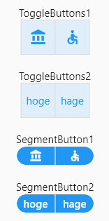
ボタンの形状が異なるのは、ちょっと微調整必要だけど。
以下がその変換用ウィジェット。ToggleButtonsの名称をToggleToSegmentに変えるだけで使える。
/// ToggleButtonsのAPIそのままででSegmentedButtonにするクラス
/// 形状の合わせこみまではしていない
class ToggleToSegment extends StatelessWidget {
  /// The corresponding selection state of each toggle button.
  /// Each value in this list represents the selection state of the [children] widget at the same index.
  /// The length of [isSelected] has to match the length of [children].
  final List<bool> isSelected;

  /// The callback that is called when a button is tapped.
  /// The index parameter of the callback is the index of the button that is tapped or otherwise activated.
  /// When the callback is null, all toggle buttons will be disabled.
  final void Function(int)? onPressed;

  /// The toggle button widgets.
  /// These are typically [Icon] or [Text] widgets. The boolean selection state of each widget is defined by the corresponding [isSelected] list item.
  /// The length of children has to match the length of [isSelected]. If [focusNodes] is not null, the length of children has to also match the length of [focusNodes].
  final List<Widget> children;

  const ToggleToSegment(
      {required this.isSelected,
      required this.children,
      this.onPressed,
      super.key})
      : assert(isSelected.length == children.length);

  /// [isSelected]のList<bool>をSegmentedButtonに渡すSet<int>形式に
  /// 変換
  Iterable<int> _selected() sync* {
    for (int i = 0; i < isSelected.length; i++) {
      if (isSelected[i]) {
        yield i;
      }
    }
  }

  /// [children]のウィジェットをButtonSegment形式に変換
  Iterable<ButtonSegment<int>> _buttons() sync* {
    for (int i = 0; i < children.length; i++) {
      yield ButtonSegment<int>(value: i, label: children[i]);
    }
  }

  @override
  Widget build(BuildContext context) {
    return SegmentedButton<int>(
      segments: [..._buttons()],
      selected: <int>{..._selected()},
      onSelectionChanged: (Set<int> newSelection) {
        if (onPressed != null) {
          for (int i = 0; i < isSelected.length; i++) {
            if ((isSelected[i] && !newSelection.contains(i)) ||
                (!isSelected[i] && newSelection.contains(i))) {
              onPressed!(i);
            }
          }
        }
      },
      multiSelectionEnabled: true,
      emptySelectionAllowed: true,
      showSelectedIcon: false,
    );
  }
}
選択状態とウィジェットのパラメータの変換は、別途関数を用意しasync*/yieldで構成しIterableを返すようにし、build内ではその関数経由でSet/Listを構築してSegmentedButtonを作るようにしている。
コメント